Feb. 6, 2016
3:14 pm
Hello:
A minor problem is that the four pictures at the bottom do not collapse (and "stack up") when viewed on a cellphone.
Can this situation be remedied?
Category #2 Design of Webpages
Re: Category #2 Design of Webpages
Feb. 6, 2016
4:08 pm
Hello:
The next project will be to do separate webpages for
偷窺與買魚(二)
and
偷窺與買魚(三)
Now that we basically have the "design" and "styling" of this series of webpages established, I am wondering if you can give me a special US$ discount for doing pages 2 and 3 now, at the same time? (I would make one US$ payment.)
Here are more details.
(1) The files are here --
http://www.taiwanbasic.com/farmculture/buy_fish_2/
http://www.taiwanbasic.com/farmculture/buy_fish_3/
(2) The top of each page is the same lettering --
日本鄉村旅遊中的感動
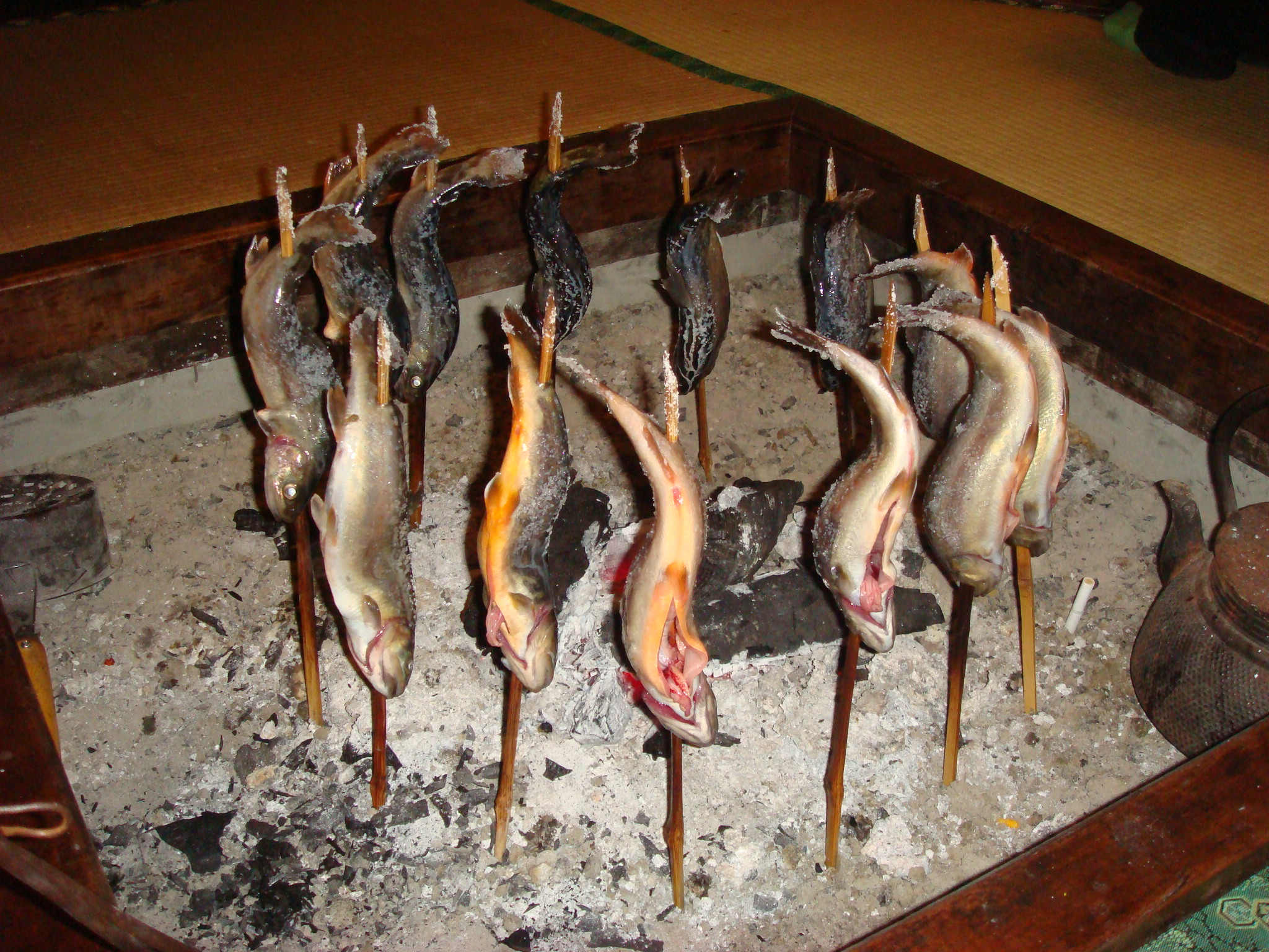
(3) The topmost picture is specified as follows --
For page 2 --
http://goo.gl/5GfD1l
For page 3 --
http://www.taiwanbasic.com/farmculture/ ... C04553.JPG
(4a) Simplified content design --
On page 1 of this series, you have what I want to call a "CENTER COLUMN," and within this is a LEFT COLUMN, and a RIGHT COLUMN. (I think you can understand this kind of explanation.)
Obviously, the background to this "CENTER COLUMN" is white.
Beyond this, you have an underlying page color, which is yellow.
(4b) For the simplified design of page 2 and page 3, let's consider keeping the "CENTER COLUMN," but removing the LEFT COLUMN within it.
So, now, what we have remaining is the original "RIGHT COLUMN structure" (i.e. this has the same width as the original RIGHT COLUMN as designed in page 1). But of course we have some additional leftover spacing on the right and the left.
Now, what can be done is to pick a slightly darker but still "complementary color" to the underlying yellow, which we will call "yellow complement."
(4c) So, now in designing page 2 and page 3, on the right and left of the original "RIGHT COLUMN" structure, what needs to be done is to fill the remaining spacing with our yellow complement color.
The totality of this now comprises our "CENTER COLUMN" for the design of page 2 and page 3.
5) The above would be easy to explain face to face, but somewhat difficult to describe with English words !!!
6a) The rest of the layout of page 2 and page 3 then basically follows the theme of what we did with the design of page 1, with the slight exception of the arrangement of the links at the bottom of the page.
6b) As you recall, the links presented in the page 1 design were vertical.
But, the links to be presented in the page 2 and page 3 designs would be at the bottom of the page, and
horizontal.
LINKS for page 2
偷窺與買魚(三) 新連接三 新連結四 片品村 簡介 新連接五 新連結六
LINKS for page 3
偷窺與買魚(一) 新連接七 新連結八 片品村 簡介 新連接九 新連結十
4:08 pm
Hello:
The next project will be to do separate webpages for
偷窺與買魚(二)
and
偷窺與買魚(三)
Now that we basically have the "design" and "styling" of this series of webpages established, I am wondering if you can give me a special US$ discount for doing pages 2 and 3 now, at the same time? (I would make one US$ payment.)
Here are more details.
(1) The files are here --
http://www.taiwanbasic.com/farmculture/buy_fish_2/
http://www.taiwanbasic.com/farmculture/buy_fish_3/
(2) The top of each page is the same lettering --
日本鄉村旅遊中的感動
(3) The topmost picture is specified as follows --
For page 2 --
http://goo.gl/5GfD1l
For page 3 --
http://www.taiwanbasic.com/farmculture/ ... C04553.JPG
(4a) Simplified content design --
On page 1 of this series, you have what I want to call a "CENTER COLUMN," and within this is a LEFT COLUMN, and a RIGHT COLUMN. (I think you can understand this kind of explanation.)
Obviously, the background to this "CENTER COLUMN" is white.
Beyond this, you have an underlying page color, which is yellow.
(4b) For the simplified design of page 2 and page 3, let's consider keeping the "CENTER COLUMN," but removing the LEFT COLUMN within it.
So, now, what we have remaining is the original "RIGHT COLUMN structure" (i.e. this has the same width as the original RIGHT COLUMN as designed in page 1). But of course we have some additional leftover spacing on the right and the left.
Now, what can be done is to pick a slightly darker but still "complementary color" to the underlying yellow, which we will call "yellow complement."
(4c) So, now in designing page 2 and page 3, on the right and left of the original "RIGHT COLUMN" structure, what needs to be done is to fill the remaining spacing with our yellow complement color.
The totality of this now comprises our "CENTER COLUMN" for the design of page 2 and page 3.
5) The above would be easy to explain face to face, but somewhat difficult to describe with English words !!!
6a) The rest of the layout of page 2 and page 3 then basically follows the theme of what we did with the design of page 1, with the slight exception of the arrangement of the links at the bottom of the page.
6b) As you recall, the links presented in the page 1 design were vertical.
But, the links to be presented in the page 2 and page 3 designs would be at the bottom of the page, and
horizontal.
LINKS for page 2
偷窺與買魚(三) 新連接三 新連結四 片品村 簡介 新連接五 新連結六
LINKS for page 3
偷窺與買魚(一) 新連接七 新連結八 片品村 簡介 新連接九 新連結十
Re: Category #2 Design of Webpages
http://192.3.160.217/farmculture/Page2/
COMMENTS of Feb. 16, 2016
2:30 pm
Hello:
This page 2 is looking much better. I have the following comments.
1) There should be a blank line before 作者:陳燕銀
And I think the color of this 作者:陳燕銀 line should be #916900 or #875F00
2) At the bottom of the page,
* There should be a blank line after the LINKS.
* Also, the LINKS should be horizontal on a line, with quite a few spaces between each one, and this line of LINKS to be centered.
3) The pictures now look better. I believe you mentioned that this was an issue of "scaling" the pictures.
However, I am wondering if it would also be a good idea to REDUCE the size of the original photo-images, (and perhaps create a separate subdirectory to hold the REDUCED size images), so that they will load more quickly.
(I noticed this "loading problem" on my cellphone ..... )
4) I noticed that the picture at the very top of the page, and the picture at the bottom-right of the page, are the same. This is fine.
And again I am not an expert on the technical details. However, if the pictures are to be REDUCED in size, to facilitate "loading" on a computer, pad, cellphone, or whatever, it might be worthy of consideration to have this picture in two versions (two different sizes) depending on whether it is being shown at the top of the page (which is a fairly big image), or the bottom-right of the page (which is a comparatively small image).
5) In your HTML coding, I notice that you have an /images/ subdirectory, etc., a styles.css, etc.
When I put these webpages (page 1, page 2, and page 3) on the internet, I hope to have all these subsidiary files inside one "master subdirectory" (spigot) and then separate subdirectories below that.
Hence, I would request that you change these HTML statements as per the following examples --
spigot/spigot2/images/images1334.jpg
spigot/spigot2/images/reduced/images1334R.jpg
spigot/spigot2/styles.css
Re: Category #2 Design of Webpages
March 12, 2016, 11:22 pm
go-health webpage
Hello:
The rounded corners look nice.
However, there are some other problems.
a) The collages should be used "inside" the text (essay) portion.
For details, see --
http://www.taiwanbasic.com/farmculture/ ... h-pics.txt
b) The picture to be used at the top of the page is another one.
The TITLE should be placed on top of this picture. (Ideally, with some "3-D" or "shadowing" effect.
For details, see --
http://www.taiwanbasic.com/farmculture/ ... DESIGN.txt
c) There is also a small subtitle on the top left --
出走&健康
See -- go-health.doc
Thank you.
Re: Category #2 Design of Webpages
March 13, 2016
8:58 pm
go-health webpage
Hello:
1a) The image of http://www.taiwanbasic.com/farmculture/ ... design.jpg
is not for use in the essay. It is for reference in designing the English language block of text within the essay that talks about this subject.
1b) This English language block of text could come before the paragraph that begins
瑞士是世界最早以觀光立國
2) The subtitle of
出走&健康
should be in the upper left corner,
which means it will also be an overlay on the top-most picture.
3) The subtitle line of
熱忱的服務精神是發展休閒農漁業唯一的基石
should be in a larger typeface/typefont
4) The subtitle lines of
何謂休閒?
服務的真諦
休閒、健康的21世紀
should be in a larger typeface/typefont and BOLD
5) The paragraph beginning 進入21世紀後
and ending 的情境裡。
should be in italics.
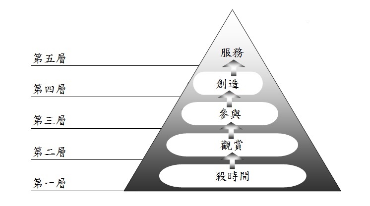
6) See -- http://www.taiwanbasic.com/farmculture/ ... ramid1.jpg
7) I guess
2016年3月
should be changed to
2016年3月 重新整理
(This should be on the left side of the center column)
8) You need a blank line between paragraphs.
9) collage3 could accompany the paragraph that begins --
回過頭來,發展休閒農漁業到底有沒有前途呢?
8:58 pm
go-health webpage
Hello:
1a) The image of http://www.taiwanbasic.com/farmculture/ ... design.jpg
is not for use in the essay. It is for reference in designing the English language block of text within the essay that talks about this subject.
1b) This English language block of text could come before the paragraph that begins
瑞士是世界最早以觀光立國
2) The subtitle of
出走&健康
should be in the upper left corner,
which means it will also be an overlay on the top-most picture.
3) The subtitle line of
熱忱的服務精神是發展休閒農漁業唯一的基石
should be in a larger typeface/typefont
4) The subtitle lines of
何謂休閒?
服務的真諦
休閒、健康的21世紀
should be in a larger typeface/typefont and BOLD
5) The paragraph beginning 進入21世紀後
and ending 的情境裡。
should be in italics.
6) See -- http://www.taiwanbasic.com/farmculture/ ... ramid1.jpg
7) I guess
2016年3月
should be changed to
2016年3月 重新整理
(This should be on the left side of the center column)
8) You need a blank line between paragraphs.
9) collage3 could accompany the paragraph that begins --
回過頭來,發展休閒農漁業到底有沒有前途呢?
Re: Category #2 Design of Webpages
March 14, 2016
10:00 am
1) In the html coding, the Chinese title can be inserted --
<title>出走是為了健康的回來 </title>
2) I guess we still need to add the author's name, see --
http://www.taiwanbasic.com/farmculture/ ... creen1.jpg
Here I used 標楷體 size 24, light/medium green color
centered on the line
3) This line
2016年3月 重新整理
needs to be on the right side
4) Ideally, a blank line is added before the links